Aha Mobile Menu
Aha Mobile Menu
Description
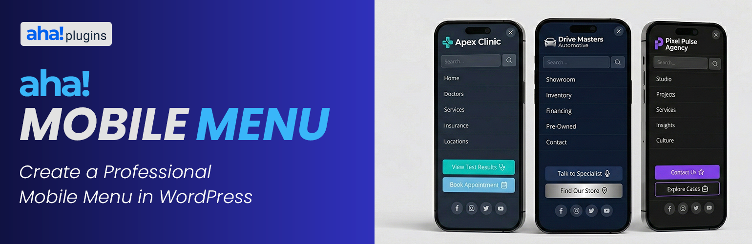
Lightweight mobile menu (off-canvas) for WordPress. Works on desktop too. Aha Mobile Menu adds a simple, fast, and customizable off-canvas menu to your site: it slides in from the left or right with slide or fade animation, and can be shown on mobile only or on desktop as well.
Features:
- Enable/disable the menu and choose position (left or right)
- Slide or fade animation
- Optional: show only on mobile (viewport < 768px) or on all devices
- Logo at the top of the menu
- WordPress navigation menu selection
- Built-in search box
- Social links with automatic icons (Facebook, Instagram, Twitter/X, LinkedIn, YouTube, WhatsApp, and more)
- Color customization: background, text, close button, search, menu links, social icons
- Color palettes for quick styling (default, dark, light, purple, blue, green, etc.)
- Close on click outside and on navigation
- Configurable trigger: default class
aha-open-sidebaror custom CSS selectors - Page and post type exclusions so the menu is not loaded where you don’t need it
- Hooks for customization
Demo, documentation & addons
Watch a demo, read the full documentation, and learn about available addons on the Aha Mobile Menu Product Page.
Requirements
- Your theme must provide a button or element with the trigger class (e.g.
aha-open-sidebar) to open the menu. Add this class to your hamburger icon or menu toggle.
Discover more WordPress plugins: Visit Aha Plugins
Installation
- Install the plugin via Plugins Add new (search for “Aha Mobile Menu”) or upload the ZIP file.
- Click Activate.
- Go to Aha Mobile Menu in the admin sidebar to configure the menu (position, content, colors, behavior).
- Ensure your theme outputs a menu toggle (e.g. a button with class
aha-open-sidebar) so users can open the menu on mobile.
Manual installation via FTP
- Unzip the plugin ZIP on your computer.
- Upload the
aha-mobile-menufolder towp-content/plugins/. - In WordPress admin, go to Plugins and activate Aha Mobile Menu.
Screenshots

Mobile Menu

Settings page – General tab

Settings page – Content tab (logo, menu, search, social)

Settings page – Appearance tab (colors)

Settings page – Exclusions tab

Settings page – Menu icons Shortcode
Faq
Make sure your theme’s menu toggle (hamburger icon or link) has the class aha-open-sidebar, or add a custom trigger in Aha Mobile Menu Behavior Additional Trigger Classes.
Yes. In Aha Mobile Menu General, uncheck “Mobile only” to show the menu on all screen sizes.
Visit the product page to explore available addons and complements for Aha Mobile Menu: Explore Addons
In Aha Mobile Menu Content, use the link under Menu to Display to open the classic Menus screen (nav-menus.php), or go directly to yoursite.com/wp-admin/nav-menus.php in your browser. Create your menu there, then select it in the plugin settings.
Reviews
Changelog
1.0.1
- Fixed saving when all social links are removed (list can be cleared correctly).
- Settings: link to the classic Menus screen for themes that hide Appearance Menus.
- Prompt to rate the plugin on WordPress.org (dismissible notice and sidebar link).
1.0.0
- Initial release.