Bento Grid Gallery
Bento Grid Gallery
Description
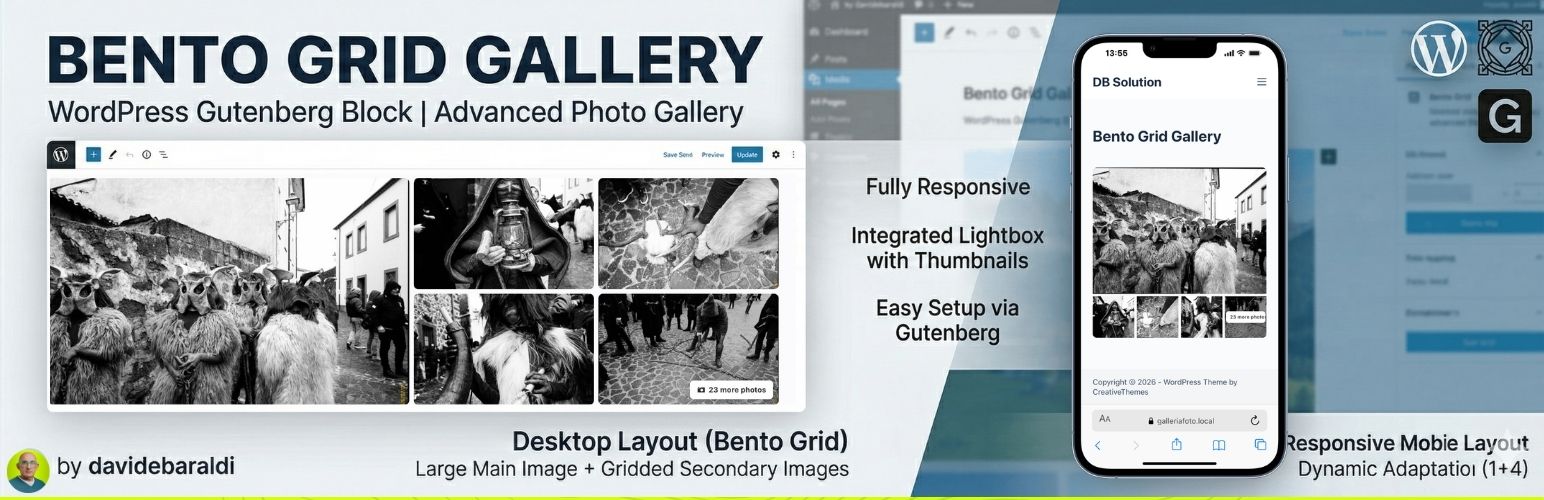
Bento Grid Gallery is a lightweight and powerful plugin that adds a new block to the WordPress Gutenberg editor. It allows you to create modern, eye-catching photo galleries without complex configurations, perfect for tourism portals and news articles to avoid classic boring layouts.
Key Features:
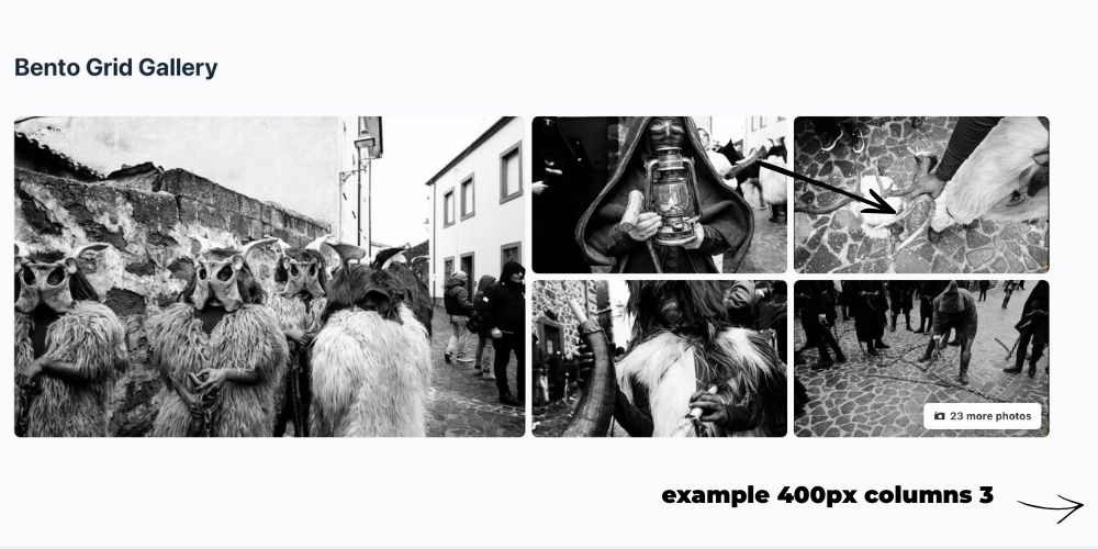
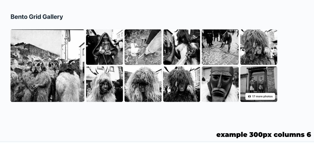
- Desktop Layout “Bento Grid”: Displays a dynamic composition with a large main image on the left and a grid of secondary images on the right.
- Mobile Layout: Fully responsive, adapts to your custom column settings.
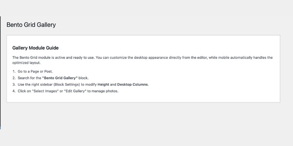
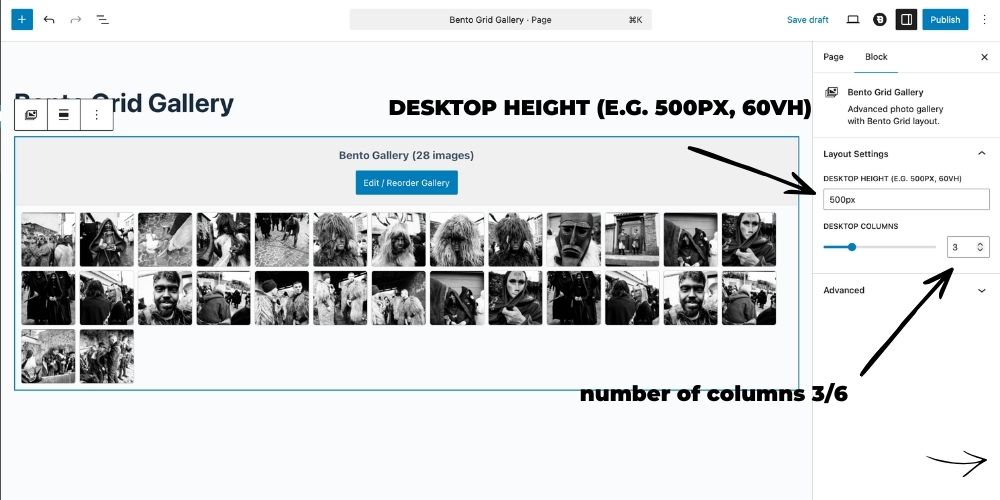
- Customizable Columns & Height: Manage desktop height, desktop columns, and mobile columns directly from the Gutenberg Inspector Controls.
- Advanced Lightbox: Full-screen image viewing with navigation arrows and a bottom thumbnail strip for quick navigation (visible on both Desktop and Mobile).
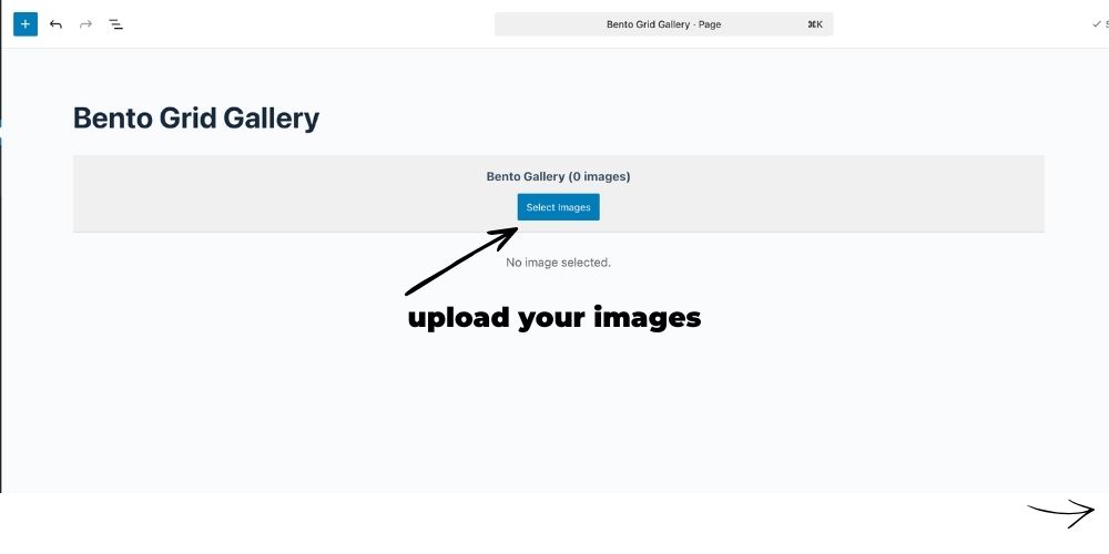
- Native Management: Uses the standard WordPress “Edit Gallery” interface for adding, removing, and reordering photos with native Drag & Drop.
- Performance Optimization: Automatically loads appropriate image sizes (
largefor main,medium_largefor secondary) to ensure fast loading speeds. - “+X Photos” Counter: If you upload more images than the visible grid allows, the last thumbnail automatically shows an overlay.
Installation
- Upload the
bento-grid-galleryfolder to the/wp-content/plugins/directory of your site. - Activate the plugin through the ‘Plugins’ menu in WordPress.
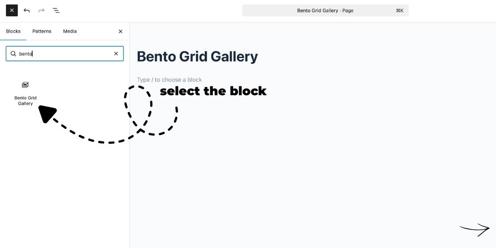
- Open a page or post and search for the block “Bento Grid Gallery”.
Screenshots
Faq
Select the gallery block in the editor, and open the right-side Settings Panel (Inspector Controls). You will find options to change the Desktop Height, Desktop Columns, and Mobile Columns.
Click the “Edit Gallery” button in the editor. The native WordPress window will open where you can drag and drop photos to reorder them.
Reviews
Changelog
1.0.1
- Fixed inline CSS in admin page (moved to enqueued external stylesheet).
1.0.0
- Initial release of Bento Grid Gallery.
- Added Inspector Controls for dynamic layout adjustments (Height, Desktop/Mobile Columns).