Carousel Slider Block for Gutenberg

Carousel Slider Block for Gutenberg
Description
A responsive modern carousel slider for the Gutenberg block editor that lets you add any blocks to your slides. Easily create sliders for hero sections, testimonials, products, and anything else using Gutenberg blocks.
🚀 Carousel Slider Version 2 is built on the modern Swiper.js library for improved performance and better mobile compatibility.
Plugin site: carouselblock.com
Features
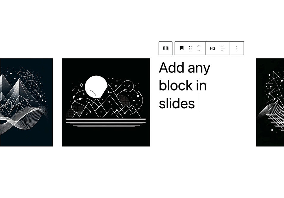
- Add unlimited slides
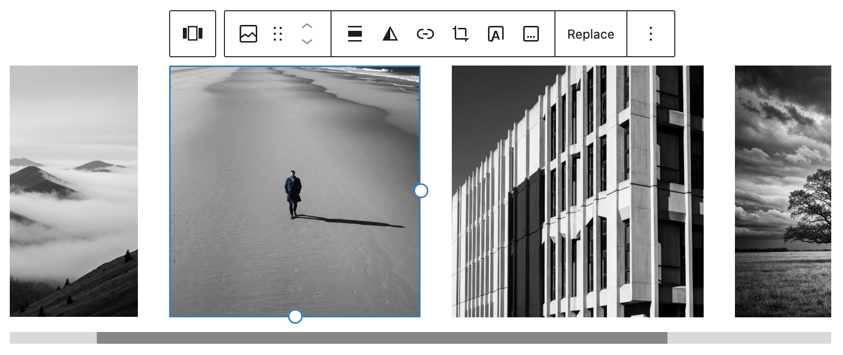
- Add any blocks to the slides
- Preview the carousel in the editor
- Responsive and touch enabled
Settings
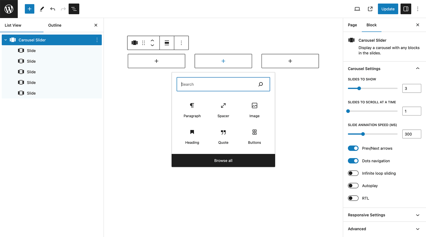
- Slides per view
- Slides to scroll at a time
- Slide speed
- Slide padding
- Prev/next arrows
- Dots navigation
- Infinite loop sliding
- Autoplay
- Pause on hover
- Disable on interaction
- Responsive settings: slides to show and scroll at given screen size
- RTL
Advanced Settings
For dynamic layouts where the slider or its surrounding layout changes after load, such as tabs, accordions, or lazy-loaded content.
- ResizeObserver
- Observer
- Observe parent elements
- Observe slide children
Included Patterns
- Full Width Hero Slider
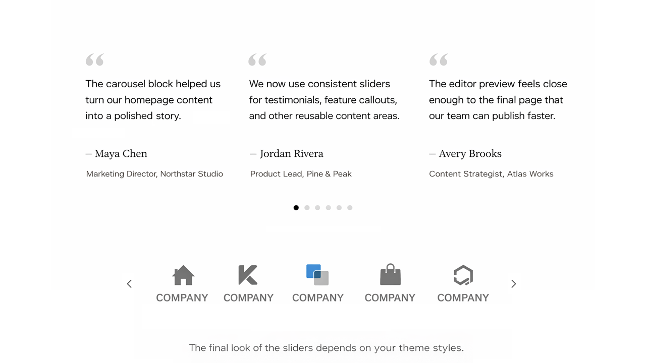
- Testimonials Slider
- Logos Carousel
The final look of these sliders depends on your theme styles. You can also fine-tune the design using custom CSS variables (see below).
Requirements
PHP 5.6+ is recommended, WordPress 5.8+, with Gutenberg active.
Documentation
Full documentation: carouselblock.com/docs
Select the Carousel Slider block from the Design category. Click the + button located at the end of the carousel to add slides. Add any block within the slides. Use the horizontal scrollbar to preview the slides in the editor.
You can reorder the slides by using the left and right arrow buttons in the toolbar.
To remove a slide, select the slide and click the three dots right above it. Click the option to remove that slide.
Click the Carousel Block (the block nesting all the slides) to show the carousel settings.
Upgrading from Legacy Carousel
See the support topic for upgrading legacy blocks to Carousel Slider Version 2.
Legacy settings remain available at /wp-admin/options-general.php?page=cb-carousel-settings. The page is hidden from the admin menu and can be accessed directly by URL.
Customizing v2 Styles
Carousel Slider v2 supports custom styling via CSS variables:
Styling documentation: carouselblock.com/docs?doc=styling
Navigation
--wp--custom--carousel-block--navigation-size: Arrow icon size--wp--custom--carousel-block--navigation-sides-offset: Distance from edge--wp--custom--carousel-block--navigation-color: Arrow color--wp--custom--carousel-block--navigation-hover-color: Arrow hover color (falls back tonavigation-color)--wp--custom--carousel-block--navigation-alignfull-color: Arrow color when carousel is full width
Pagination (dots)
--wp--custom--carousel-block--pagination-top: Top offset--wp--custom--carousel-block--pagination-bottom: Bottom offset--wp--custom--carousel-block--pagination-bullet-size: Bullet size--wp--custom--carousel-block--pagination-bullet-active-color: Active bullet color--wp--custom--carousel-block--pagination-bullet-inactive-color: Inactive bullet color--wp--custom--carousel-block--pagination-bullet-inactive-hover-color: Inactive bullet hover color (falls back toactive-colorif set)--wp--custom--carousel-block--pagination-bullet-active-opacity: Active bullet opacity--wp--custom--carousel-block--pagination-bullet-inactive-opacity: Inactive bullet opacity--wp--custom--carousel-block--pagination-bullet-inactive-hover-opacity: Inactive bullet opacity on hover (falls back toinactive-opacityif not set)--wp--custom--carousel-block--pagination-bullet-horizontal-gap: Space between bullets (horizontal)--wp--custom--carousel-block--pagination-bullet-vertical-gap: Space between bullets (vertical)
Block Spacing
--wp--custom--carousel-block--image-margin-top: Top margin for image blocks--wp--custom--carousel-block--image-margin-bottom: Bottom margin for image blocks--wp--custom--carousel-block--cover-margin-top: Top margin for cover blocks--wp--custom--carousel-block--cover-margin-bottom: Bottom margin for cover blocks
Theme JSON Support
All the CSS variables can also be defined directly inside your theme’s theme.json under the settings.custom key.
For example:
{
  "settings": {
    "custom": {
      "carousel-block": {
        "navigation-size": "22px",
        "navigation-color": "#000",
        "pagination-bullet-active-color": "#000"
      }
    }
  }
}
Frontend API
Carousel Slider exposes a small frontend API for integrations with tabs, accordions, modals, or other hidden UI.
For some of these dynamic layout cases, the Advanced Settings observer options can also handle updates automatically.
window.CarouselSliderBlock.init( container ): Initializes carousel instances inside the given container.window.CarouselSliderBlock.update( container ): Updates existing carousel instances inside the given container and initializes any that are not yet initialized.
Installation
- From your WordPress dashboard go to Plugins > Add New.
- Search for Carousel Slider Block in the Search Plugins box.
- Click Install Now to install the Carousel Slider Block Plugin.
- Click Activate to activate the plugin.
- Carousel Slider Block will be added to the Design block group in the editor.
If you still need help. visit WordPress codex
Screenshots
Add any blocks to the carousel slides

Hero sliders
Testimonials and logo carousel
Carousel settings
Carousel editor
Faq
Gutenberg is the name of the new block based editor introduced in WordPress 5. Gutenberg makes it easy to create content within the editor using blocks.
Select the Carousel Slider block from the Design category.
Select the Carousel Slider block. Click the plus button to add slides to the carousel.
Add the Carousel Slider block from the block inserter and upload images or create slides inside the block. Each slide can contain images, text, or other blocks.
Yes. You can add multiple Carousel Slider blocks to a page or post and each carousel will work independently.
Yes. Each slide can contain images, text, buttons, or other blocks depending on how you want to design your carousel.
Yes. The carousel is fully responsive and works on mobile phones, tablets, and desktop devices.
Yes. The Carousel Slider block works in both WordPress posts and pages anywhere the block editor is available.
The Carousel Slider block uses the lightweight Swiper library for fast and smooth performance. For best results, use optimized images and enable lazy loading on any Image blocks inside slides so images load only when needed.
Use the Advanced Settings observer options when the slider or its surrounding layout changes after load. For custom integrations, you can also call window.CarouselSliderBlock.init( container ) or window.CarouselSliderBlock.update( container ) after the layout changes.
The Carousel Slider block uses the lightweight Swiper.js library because it provides fast, smooth, and responsive sliders. Swiper is widely used, mobile-friendly, and optimized for performance.
Install the Carousel Slider plugin and add the Carousel Slider block to your page or post using the block editor.
Reviews
Lovely little plugin
By 
Simple, yet very flexible slider that is easy to use
By 
This slider operates as a block inserted on a page/post. It them accepts other Gutenberg blocks, (text, image, header, etc.) as content for the slider. All controls for the slider are on the block itself. Save as a pattern to repeat the configured slider on other pages.
This is a very simple yet flexible plugin. Highly recommended
Love this block
By 
I love how simple and straightforward it is. The block is really versatile. Support was great too when I made a post!
Yeah for simple, free, and open source slider block!
By 
A great and simple plug-in. Exactly what I wanted.
Does what it says. Awesome
By 
Does what it says. Simple and practical, easy to use. Thank you for creating this!
Great flexibility perfectly coherent with base Gutenberg
By 
Incredible flexibility, it integrates perfectly into the current Gutenberg blocks pool for its functionality and layout.
I noticed that the support is somewhat missing, probably because the developer is alone in this. It would be great if the community could help maintaining this so useful piece of code for as long as possible.
Very simple and easy to use
By 
Very easy to use and works very well
Easy and EXCELLENT
By 
Works like a charm, simple or complex it is up to you.
Beware update to 1.0.15
By 
Updater beware. 1.0.15 totally broke my slider layout. They just all load vertically on top of each other now. Trying to diagnose/revert, but worth knowing in case it happens to you also.
Update: Excellent customer service. Plugin has been fixed. Thank you.
Solid basic slider block with room for improvement
By 
Basic Gutenberg block that lets you manually assemble other Gutenberg blocks into a slider.
There is a minor technical issue. I only see one of the two next/prev arrows, and that arrow overflows the page width by default when no padding or margin is applied to the slider.
The plugin is limited in scope to only allow creating slides manually. That mirrors the scope of the built-in suite of Gutenberg blocks nicely, but one dynamic feature I think would be appropriate is to load a configurable number of blog posts dynamically, optionally with filters applied.
The plugin author has been very quick to update the plugin, so this review may be outdated by the time you read it.
Changelog
2.1.1
- Improved PHP 8+ compatibility for the hidden settings page
2.1.0
- Added starter carousel patterns for hero, testimonials, and logos
2.0.10
- Stability fix
2.0.9
- Hid the legacy settings page from the admin menu while keeping direct URL access at
/wp-admin/options-general.php?page=cb-carousel-settings - Added advanced Swiper observer settings and updated documentation
- Increased default vertical spacing for navigation dots
2.0.8
- Simplified the labels in the editor panel
- Removed “v2” from block titles and added “v1” to legacy blocks
2.0.7
- Added pauseOnMouseEnter and disableOnInteraction to autoplay settings
- Exposed frontend carousel init() and update() APIs for tabs, accordions, and other hidden UI.
2.0.6
Additional CSS variables
2.0.5
Fix block insert
2.0.4
- Fix for hide legacy option
- Update plugin description
2.0.3
Removed block.json from legacy blocks
2.0.2
- Added custom CSS variable for pagination bullet gap
- Corrected documentation for navigation color variable
- Removed unnecessary max-width property blocking inner block widths in editor
2.0.1
- Changed legacy block setting to “Show legacy blocks”, disabled by default
- CSS update for pagination margin
2.0.0
- Introduced Carousel Slider v2 built on Swiper.js
- Legacy blocks are still supported but can be upgraded to v2 via block transforms
- Added settings to hide legacy blocks and legacy upgrade notices
1.0.16
Fix slider init.
1.0.15
Button block appender fix.
1.0.14
Update CSS for image block centering.
1.0.13
Reverted Slick init to working solution – outside the WP block build process.
1.0.12
Added tag dependency.
1.0.11
Fixed layout issue in rows.
Code refactoring.
1.0.10
Fixed lodash error with latest WordPress 6.4 update.
1.0.9
Fixed error message on Widget Editor screen. Tested on WordPress 6.3.1.
1.0.8
Small CSS improvements in the editor. Updated slick CSS stylesheet handle. Tested on WordPress 6.0.
1.0.7
Added responsive setting for slides to scroll at a time.
1.0.6
Eliminated block margin CSS issue in slides.
Changed the style of the “Add slide” button.
1.0.5
Added block.json. Improved carousel block layout in the editor. Updated slide block icon. Tested for WordPress 5.9.
1.0.4
Improved UI experience by using inner blocks controls. Added RTL option. Removed padding option. Updated slide block icon.
1.0.3
Added autoplay settings.
1.0.2
Updates for latest WP Gutenberg version. Fixed editor CSS.
1.0.1
Fixed lodash issue.
1.0.0
First release of the plugin.