Triopsi Block Visibility
Triopsi Block Visibility
Description
Triopsi Block Visibility extends the WordPress block editor (Gutenberg) by adding responsive visibility controls to every block’s settings sidebar. Control which blocks appear on mobile devices, desktop devices, or both.
Key Features:
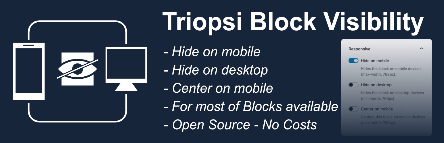
- Hide on Mobile – Hide blocks on screens smaller than 768px
- Hide on Desktop – Hide blocks on screens larger than 768px
- Works with all Blocks – Compatible with core blocks and third-party blocks
- Visual Indicators – See which blocks are hidden directly in the editor
- No Configuration – Install, activate, and start using immediately
- Simple Toggle Controls – Easy-to-use switches in the block inspector
- CSS-Based – Lightweight solution using CSS classes
Perfect for creating responsive designs where certain content should only appear on specific devices. For example, show a detailed table only on desktop while displaying a simplified version on mobile.
Both options can be used simultaneously if needed (useful for draft content or A/B testing).
Installation
Automatic Installation
- Log in to your WordPress admin panel
- Navigate to Plugins > Add New
- Search for “Triopsi Block Visibility”
- Click “Install Now” and then “Activate”
* Center on Mobile – Center blocks on screens smaller than 768px
Manual Installation
- Download the plugin files
- Upload the
triopsi-block-visibilityfolder to the/wp-content/plugins/directory - Activate the plugin through the ‘Plugins’ screen in WordPress
After Activation
- Edit any post or page with the block editor (Gutenberg)
- Select any block
- Look for the “Responsive” panel in the right sidebar (Block settings)
- Toggle “Hide on mobile” or “Hide on desktop” as needed
Faq
Yes! The plugin adds the responsive controls to all Gutenberg blocks, including core blocks (like Paragraph, Image, Heading) and third-party blocks from other plugins.
The plugin uses 768px as the breakpoint:
* Mobile: max-width 768px
* Desktop: min-width 769px
Yes, you can enable both “Hide on mobile” and “Hide on desktop” simultaneously. This is useful for draft content that you want to temporarily hide everywhere, or for A/B testing purposes.
The plugin is very lightweight and uses only CSS to hide blocks. There is no JavaScript overhead on the frontend, so performance impact is minimal.
Reviews
Changelog
0.1.0
- Initial release
- Hide blocks on mobile devices (max-width: 768px)
- Hide blocks on desktop devices (min-width: 769px)
- Visual indicators in the editor
- Works with all Gutenberg blocks
- i18n ready for translations
1.1.0
- Added option to register a plugin-wide toggle for enabling/disabling the responsive controls.
- Accessibility improvements for toggle controls in the block inspector.
- Fixed editor outline color regression and label overlap in tight editor layouts.
- Reduced CSS specificity to play nicer with theme styles.
- Added “Center on Mobile” option to center blocks on screens smaller than 768px.
- Improved editor visual indicators and labels for better clarity.
- Fixed duplicate CSS class issue when toggling visibility repeatedly.
- Improved sanitization and escaping for saved block attributes.
- Compatibility fixes for PHP 8.0+ and WordPress 6.8.
- Minor performance and CSS optimizations.
- Polished inspector UI and accessibility (ARIA labels).
- Persist block visibility classes server-side to ensure frontend/backward compatibility.
- Ensured compatibility with a wide range of third-party blocks.
- Added translations scaffolding and updated textdomain usage.
1.1.1
- Update Readme. Ready for WordPress Plugin review
1.1.2
- Fix delete unlesed files
1.1.3
- Fix via plugin checker
2.0.0
- Change name and slug